 I’m starting a new altered book round robin in January, with my local mixed-media group. While I was getting my book ready, I decided to go ahead and create the cover design that was floating around in my head. I wanted something that looked like it was really a part of the original book, and sort of subtle.
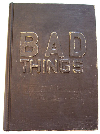
This is the finished book cover I created using just some paint and gesso, and a few chipboard letters. These letters are everywhere right now, but of course, none of the ones being sold commercially were exactly right. As usual, I made my own.
Here’s how the cover went together:
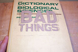
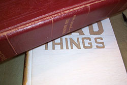
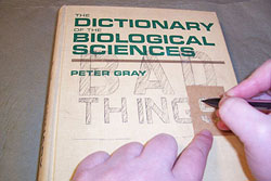 First, I layed out the lettering using some commercial stencils. I have these in just about every size, so I just played around until I could fit the word things under the word bad nicely. Since the whole book would be covered with paint and gesso shortly, I just traced the design out directly onto the book—and you can see here what the real book looked like starting out. Not pretty!
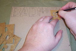 Once I had the design figured out, I traced the letters onto a sheet of chipboard. You can buy chipboard at most scrapbook stores, but I just save the backs of all my drawing pads, and the packing boards included in the packages of sheet protectors I use to pack collage sheets at Ten Two Studios, and recycle it into my projects.
Most commercial stencil letters have bridges—places where the line of the letter is broken to create a stronger template shape. I drew across the bridges after tracing, to create letters that were single pieces.
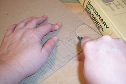 Next, I cut the letters out. This was done with a sharp craft knife. I cut all the straight lines of the letters first, and then the curves. My commercial stencils were very boxy, so the curves were minimal and not too painful to cut.
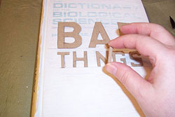
 I lined up the cut letters on the book cover, just for a little gratification. I thought I might glue them in place now, but realized that the book’s original cover art was making it difficult to see whether they were really placed correctly. Perhaps a little basecoating would help…
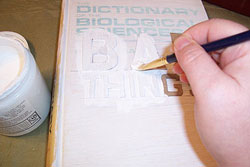
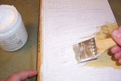 I applied a light coat of gesso to the cover to give myself a clean place to work.
 Once the gesso was dry, I drew a couple of guidelines, and positioned the letters on the cover.
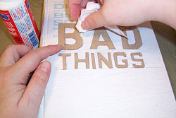 I glued the letters in place with a little Weld Bond, and pressed them down hard. Here and there, excess glue oozed out. I removed this with a piece of tissue.
 The chipboard really wanted to curl when damp with glue, so I weighted the letters with a heavy book, and let the glue dry completely. They were nice and flat when I removed the book a few hours later.
 To make the letters appear as if they were part of the book cover rather than just applied, I added several coats of gesso. I used a small brush, and brushed the gesso from the cover up over the letters, allowing it to sort of puddle against the edges of the letters. Each coat was allowed to dry completely before the next was applied.
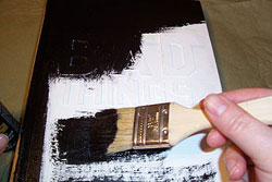 I painted the whole book black, front and back, and let it dry.
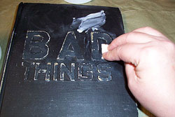
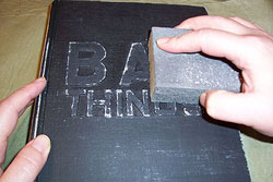 To complete the look, I sanded the whole cover with a coarse sanding block. When I do this kind of distressing, I try to concentrate the sanding where the book would normally show signs of wear: raised areas and edges.
 I applied a line of black duct tape to the spine of the book, then covered the whole thing with a coat of matte medium to protect the painted surfaces.


