I’ve been working with new altered book artists through the mentoring program on the Yahoo Altered Books Group for quite a few years, and one of the questions almost every one of my “mentees” asks is how I plan my layouts.
Well, the answer to this is that I really don’t. I mean, I have an idea in my head when I start, but it’s not set in stone. I sort of dive in, and let whatever is going to happen, happen.
Since I started a new round robin with my local mixed media group this week, I decided to document the first layout I did in someone else’s book. Here’s how it went:
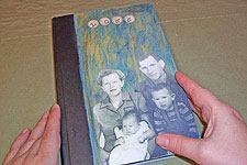 The book I received last Saturday belonged to Amy. She’s relatively new to our group, but certainly not new to altered art. Since I’ve seen some of her work, I know that she likes vintage, girly things. Her book was titled Loss—here’s the cover. She also did a couple of layouts in it, which were vintage, and romantic in feel. Whenever I work in a book, I try to take my cue from the work already done in it—so, if the book is soft and romantic, I probably don’t want to dump hard edged, modern grunge into it without a really good reason.
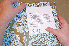 Amy included a rules page in her book. Most altered books I’ve received in round robins have some sort of rules included by the book’s originator, that tell her likes and dislikes, and give some minimal guidance about the theme of the book. Amy’s rules were pretty liberal: she tells us we can talk about any sort of loss, lost items, feelings, etc. She also doesn’t care of the book gets lumpy and bumpy along the way. It’s customary to follow whatever is written in the book’s rules, so if she had written that it’s required we work all in blue, or that every layout have a bird in it, as silly as that might sound, all the artists would be asked to stick to it. Mercifully, Amy did not require those things—just have fun, and talk about loss.
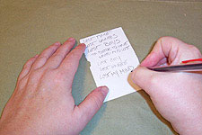 Right after reading the rules, I whipped out a pencil and paper, and did a little free association. Amy’s layouts had the word lost in them, and I wanted to follow along, so I started listing phrases with that word in them. This list will stay with the book for the month I have it, so I can look at it whenever I’m working on it, and think about the possibilities.
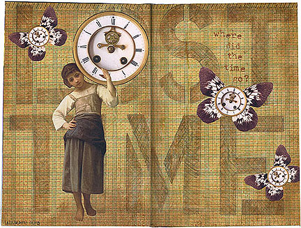
As soon as I saw this book, I knew I wanted to do something about lost time or lost hours—a running theme in my life right now. I decided to use lost time as my jumping off point for the first layout.
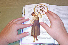 In my head, I saw a little girl balancing a huge clock on her shoulders, so I started with that image. I actually used two images to create this: one of a clock, and one from a painting of a girl balancing a water jug. In keeping with the look of the artwork already in the book, I chose vintage, romantic looking items.
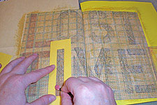
I measured out the size of Amy’s book, and on my computer, created a page that size, then sized my images accordingly. Here they are, cut out and laying on the book. Now where do I go?
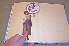 I like big and bold, but Amy’s book is small. I decided to use the word motif she’d already started, on a much larger scale—lost time would be the background for the piece. I used some stencils, and roughed out the placement on a piece of scratch paper, figuring that the girl with the clock would take the place of the I in time, and the O in lost.
OK, I have an idea for the background going, but gee, it’s sort of dull—it needs texture. Maybe numbers, like a time schedule?
 I found the answer to my background in the back of an old atlas—the number chart showing the mileage between major cities. It was the perfect size to cover the two pages of Amy’s book, but sort of modern looking. I know just how to fix this once it’s anchored into the book, so I went ahead and glued it in, then stencilled the letters. I went ahead and colored them in with the pencil—you’ll see why in a minute.
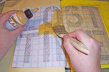 My cure-all for bright, modern pages is to tone them with a little glaze—in this case, Golden glaze in ochre. Clear glaze is a great thing to have around your workroom, since it can be mixed with any cheap acrylic to create custom glaze colors.
Here, you can see why I colored in the letters with pencil. The graphite of the pencil blends just a bit with the glaze as I brush over it, so the letters and the background blend a bit. The glaze also reacts differently on the areas colored with pencil, so I get a slightly different color. Instead of letters floating on a background, or letters disappearing into it, I get a nice, unified look.
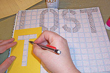
 Well, OK, the glaze dried, and the lettering did blend into the background just a little too much. I grabbed the stencils and some chalks, and warmed them up a bit with some brown tones. I want to end up with something that is readable, but doesn’t jump out more than the focal image of the girl with the clock.
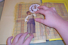 Hey, she looks pretty good on this background! I went ahead and glued her down, positioning carefully to cover the proper letters, and keep the clock balanced on her shoulder.
Well, now what? It just doesn’t look finished yet. It needs some visual interest.
 Maybe some aging? I did some toning around the edges with brown glaze, and then dragged some up into the layout, to give the page a little more texture. Instead of flat ochre with brown letters, it’s now more mottled, and looks a little older.
Better, but still not exactly right. It’s missing a little fun…
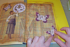 …and fun in this case means little clocks flying on butterfly wings. I did three, in two different sizes. Varying the size of embellishments often means you can get away with fewer of them—and I’m a big believer in the idea that less is more. I also almost always embellish in odd numbers. Odd is easier on the eye than even, for a lot of weird psychological reasons.
I positioned the butterflies so they didn’t cover too much of the background text.
 Here’s the finished layout, blasted with a nice coat of my favorite sealer: Aussie Mega Hairspray. It’s cheap, it smells better than commercial sealers, and it generally sprays in a layer of tiny spots, which gives a nice effect to vintage work. I’ve been using it since I was a poor design student, and had no choice.
Just because I know I do this: notice that they’re in a nice diagonal line of white elements from top left to bottom right? That’s me, leading your eye across the page. I tend to embellish on the diagonal without realizing it.
There ya go. That’s my thought process. Not terribly neat and tidy, is it?


