One of the things that causes new artists to struggle is combining color. Creating artwork using a single color combined with black and white, or using items of all the same color is pretty simple. How do we move beyond that to create interesting color palettes?
Well, you know me—I have a shortcut for everything. I look for interesting color combinations that have already been planned out by professionals, even when I’m doing work as a professional. A fabric store is a great place for gathering color inspiration. I’ve used this technique in a variety of different areas: when planning color schemes for a set of costumes, a new dollhouse, a set of scrapbook papers, and even the decorating scheme for my house.
Now, I know some of you are wondering why I’ve chosen to use fabric for my inspiration, rather than, say, scrapbook papers. Well, go to your local JoAnn store (or any store that sells both fabric and craft supplies), and look at the number of papers they have in their scrapbook section—and then turn around and look at how many fabric choices there are. Any questions?
My other reason for choosing fabric over paper products for this lesson is that I’m often looking for color inspiration that doesn’t look like everyone else’s. If we’re all buying the same 25 patterned papers, we’re going to end up with very similar palettes. What if muted grunge is the look this year in paper, and I want 60’s brights? I can just dig down in my stash of fabrics or hit the local thrift store to find something interesting to spark me.
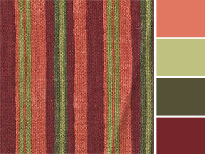
 Let’s start with something simple—stripes. It’s usually pretty easy to pull colors from stripes, dots, and other bold graphic designs built with solids. Here, I’ve used a striped piece from my stash, scanned it, and using the eyedropper tool in PhotoShop, pulled some solids colors from it. Looks sort of like a paint chip, right? Well, the theory here is sort of the same, but instead of fumbling with many chips to get a combination that works well together, I’m using a single piece of fabric to guide me. I can use the solid colors I’ve pulled to match items from my ephemera stash, inks, and papers.
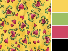 Here’s some fabric that’s just a tiny bit more complex. It’s still a bold, graphic design, but it has some shading here and there. I don’t necessarily want to pull every shade of pink from this design—maybe just one or two. I’ve also used the black outline as part of the palette, to give all the bright tones a sort of anchor. Brights always look brighter when there’s a little black thrown in.
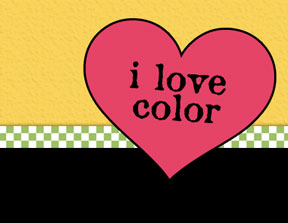
This looks like a good color combination for a card. Let’s try one…
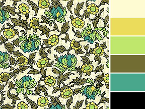 Now, we’re getting even more more complex. This piece combines more colors in a graphic way. They’re still solids for the most part, so it’s easy to break them out into little chips.
I like this one a lot, because I can honestly say I would not have thought to put that light green and the teal in the same color palette. Maybe I’ll try using this for an altered book layout.
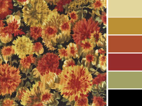 One more, and this one’s very complex—so much so that I could pick and choose which colors to put into my chips, and which to leave behind. It’s a little more difficult to choose colors from a fabric that has a blended or shaded design, but if that’s the fabric that speaks to you when you go shopping, give it a try.


