As I was surfing blogs and web sites this week, I saw several references to the bandana technique. Each artist had her own approach to it, but the results were the same: a printed surface that looked like a bandana.

I decided to give it a try, using some materials that are a little more accessible, and making the black and white print effect a bit bolder.
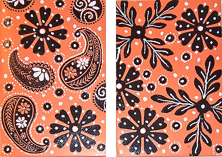
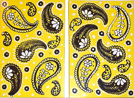
I started with some brightly colored, solid backgrounds (those of you who have been shopping for school supplies this week will recognize them as paper report binders). Bandanas come in all sorts of colors, so I chose yellow and orange.
I also chose some rubber stamps that were ideal for creating backgrounds. I’ve had a paisley stamp set sitting around unused for quite a while, so I started with that. I also pulled out some chunky foam stamps, which I like to use for backgrounds. In looking at a group of real bandanas at my local craft store, I decided that any basic shape or design would work—this is one technique that benefits from using stamps that aren’t very detailed.
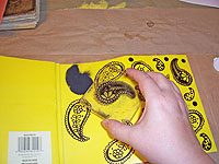
 Start by stamping large images in black pigment ink. Spread them out, to leave room for smaller stamps in between.
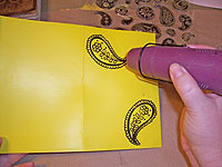 Apply black embossing powder to the designs, and give them a blast with a heat gun. This makes the black designs quite pronounced and dark.
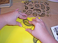
 Repeat the stamping and embossing with smaller stamps. I used three different stamps on each of the samples.
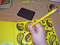 Anything can be a stamp—even a pencil eraser. This is my favorite way to create small perfect circles: just use a new pencil eraser as a stamp, pressing it onto the inkpad, then straight down onto the background. These were also embossed with black powder.
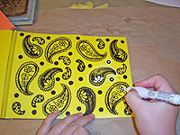 Now, the magic: add white accents to the design with a white correction pen. I found my Bic Wite-Out correction pen at Staples, but these things are sold in the office supply section of most stores. The white it produces is thick and matte, and quite bright. I liked this particular pen because it was designed to be squeezed, so I could apply a very fine dot, or a nice-sized puddle of white with ease.
Use the designs on your stamps as a guide to applying the white accents. For example, I colored in flower centers, or applied dots around the outer edges. I also added random white dots scattered around the stamped designs.
I was surprised at how effective this was. The design looked sort of boring when it was just stamped, but the addition of the white elements really made it all pull together. I also discovered that it didn’t matter whether I applied my white with machinelike precision, or was somewhat sloppy.
How’s that for an end of summer idea?


