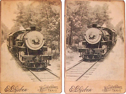
 These two antique cabinet cards are complete fakes, made for an altered book layout about a train crash that happened in 1896. They started as a single black and white photo of a train that was taken fairly recently, and printed on glossy stock.
I wish you could hold these cards in your hand, because even when mixed with the real thing, it’s hard to tell they’re fakes. I achieved this effect with a little computer magic and some smart paper choices. Here’s how they were made:
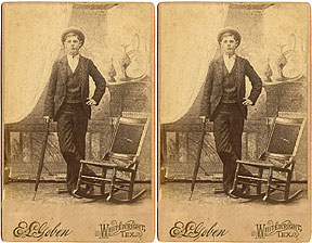
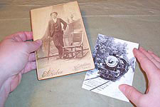 Here’s where I started, with a single black and white photo of a train, and a real cabinet card. I chose this particular cab card because it has a footer that worked for the project—it’s actually from a town in Texas that’s very close to the location of the train crash. It’s also close in size to what I’ll need for my faked photos.
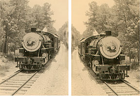 I scanned the train and the cab card, and split them into two files. Using PhotoShop, I recolored the train photo to match the tones of the cab card, and added noise to give the photo a less modern look. Then I duplicated the photo to create my two trains. To keep them from looking so much like a mirror image of the same train, I resized one so it appears larger in the frame.
I printed this on ivory cotton stock, using my color laser printer.
 I did a little cleaning of the cab card scan to remove most of the obvious breaks and creases. I also cloned a bit of the frame so the old photo wouldn’t show when the new one was layered over it. I resized the card so the photo would fit on it.
I printed this file on smooth, glossy paper, because the cab card frame is just a bit shinier than the face of the photo. Printing on different papers really helps give the finished product a more realistic look.
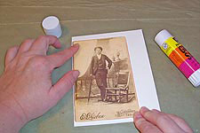 I glued the cab card prints to a piece of white chipboard using a glue stick, and paying extra attention to the edges. I really want it to be hard to tell that this top layer was glued in place, since the writing on most cab cards is stamped into the board.
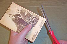 I cut the cards out, rounding the corners slightly.
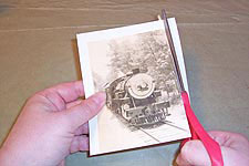
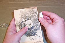
 I cut the new photos out, and glued them onto the cards using a glue stick. These went right over the prints of the old photo, which I used as guides for poisitioning.
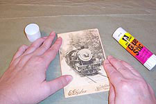
 Each card was aged with several colors of chalk inks. This helped make them look less like duplicates, and more like individual photos.


