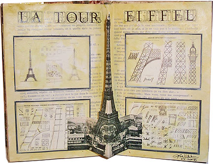
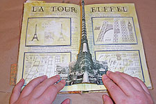
 This week, I worked in the altered book of local mixed-media group member Mary. Her book is titled Paris of the Past, so how could I resist doing a layout about the Eiffel Tower?
I’ve done pop-up Eiffel Towers in several previous altered books. The simple tabbed method I use to create them can be adapted to just about any image that can be folded.
Here’s how this layout went together:
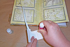
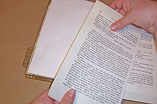 First, I put the background in. Mary’s book used to be a blank journal, so I covered the pages with French text, applying it with a glue stick.
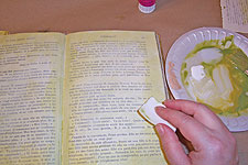 Since the text pages were glaringly new and modern, they needed a little toning, which I did with a couple of glazes.
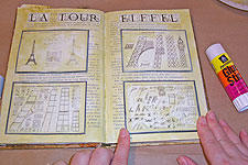 Over the French text, I applied some little Eiffel Tower blueprint images, and the title, all of which were created on my computer and printed on good paper, then glued in place with a glue stick.
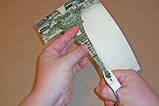 OK, now it’s time to deal with the pop-up. I found a vintage photo of the Eiffel Tower, and sized it to fit into the book, making sure it was no taller and no wider than the layout—that’s important. I printed the image out on cardstock, and carefully cut it out with sharp scissors, leaving some extra scenery on either side of the tower to act as my tabs.
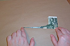 I wanted the center of the pop-up to be the center of the tower, so I folded the postcard on the tower’s center line. You don’t have to make the center of the pop-up the center of the image—and in this case, my center is not the center of mine. There’s more scenery to the left of the tower than there is to the right. That’s OK.
 Next, I folded the tabs. I’m going to even out the pop-up here, folding the tabs the same distance from the center fold. See that big strip of white? That’s how much larger one of my tabs is than the other. As long as the fold of the tabs is the same distance from the center line, it doesn’t matter how large they are, or whether they’re the same size. It’s also important that the fold for the tabs be parallel to the center fold.
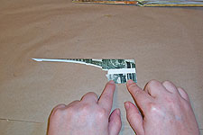
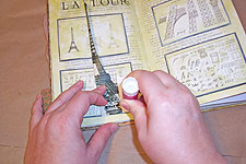
 Here’s the folded pop-up, with its tabs in my hands. You can see clearly here that the tower is in the center, and the two sides of the pop-up are the same size, but the two tabs are clearly different sizes.
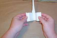
 Now, I test the pop-up, and start thinking about positioning. If I position the tabs far apart, the pop-up will be flatter than if I position them closer together. I really want this tower to jut out at the viewer, so I’m going to place them closer. When the pop-up looks right, I make a mental note of where the tabs should be glued in. You might want to make a mark with a pencil on the background as a guide if you’re not comfortable with guesstimating.
 Now, I apply glue to one tab with a glue stick. This is a good time to be liberal with the glue, because this tab is going to endure quite a workout over the life of the book. Just add glue to the one tab for now.
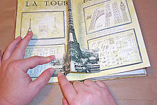 Press the gluey tab onto the background where you’ve decided it should be positioned.
 Fold the pop-up down, so the second tab is facing you. Apply a liberal amount of glue to the tab, and hold the pop-up in position.
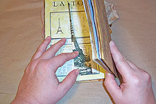 Close the book over the pop-up, removing your hand as the facing page touches it. You’re closing the book over the gluey tab. Press down on the back of the book.
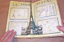 Open the book, and you’ll have a perfectly positioned pop-up. Press down on the newly glued tab, then close the book again, and let all the glue dry.
This method never fails for me. I always end up with pop-ups that are perfectly centered!


