 For about two years now, I’ve been getting requests for a lesson on how I make faux postage. Now that I also sell faux postage stamps, those requests have increased to a level I find sort of offensive—after all, I’m selling my faux postage stamps to support myself, and this predominantly free web site. Asking for a lesson on how to make something I’m selling seems a tad rude, doesn’t it?
I’ve long deflected requests for this lesson with the explanation that I use a $700 software package to make mine, so it’s not really fair of me to write a how-to that will immediately be impossible for many readers to follow. Sadly, the requests for the faux postage lesson have now risen to demands, so here it is, if only to give me a little peace.
Before you continue, please read these huge disclaimers:
- Don’t say I didn’t warn you—this will be virtually impossible for anyone who doesn’t own Adobe PhotoShop to execute easily. Please do not email me complaining about this. You’ll have to either spend the money for the software, or find someone else to teach you their method—and last time I checked, there were painfully few lessons on making faux postage floating around out there. (So if you’re a faux postage artist, get off your butt and write a tutorial on your method, already!)
- Please do not email me asking for instructions on how to do this using any other software. I use PhotoShop, and I’m not interested in exploring other software. You should find someone who uses your software to help you out.
- Please do not email me giving me instructions for how to do this using your software. Again, I use PhotoShop, so I’m not interested in how it works in other software. If you know how to make faux postage stamps using tin foil and duct tape, feel free to post those instructions—don’t send them to me.
- Mostly, please do not email me asking any other questions about making faux postage. This is what I know, and what I’m willing to share. If this doesn’t do it for you, please work it out on your own.
- Last, but not least, this is NOT the method I use to make the faux postage stamps I offer for sale at Ten Two Studios. Those are created using a different sort of template. Please don’t email me asking how I make that happen—it involves some expensive hardware, a talent for calibration, and about ten years of PhotoShop experience. Beyond that, I’m not sharing.
OK, now that you know my mood, let’s get down to work.
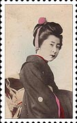
 First, you’ll need some sort of stamp template. How about the one I posted last January, in my article on artistamps? Look, here it is! Click on the stamp at left, and a larger version of it will pop up. Save the larger version to your hard drive in a place where you can find it. I reccomend starting a new folder, because you’re going to need some other image files to make your first stamp. Why not store them together to make your life easier? I have a folder of artistamps on my computer, and subfolders for each stamp set—that way, all my art is stored together where I can easily find it. I’m a subfolder kinda girl—do whatever works for you.
Now, this is actually a huge stamp—like, over five inches high. Nobody needs a stamp that big. It’s also a low-resolution file. If you’re into tweaking your resolution a bit, you can turn it into a smaller, higher resolution file that will be the right size for print. I wrote a lesson on how to play with resolution a while back—if you need help with this part, you might want to take a minute and read it.
For this lesson, I’m really building my stamps at 150dpi, and they’re about 2-1/2 inches high. That’s a nice oversized stamp that looks good when it’s printed, but is still small enough to identify it as a postage stamp rather than a serving platter. Go ahead and tweak your stamp’s resolution and size to whatever you’d like. What you do won’t effect the rest of the steps.
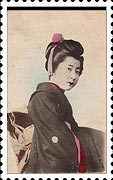
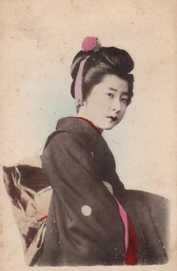 Next, you’ll need the main image for the stamp. I’m using a copy of one on my Land of the Rising Sun image CD. Any image that’s at least the size of the center, black section of the stamp or larger will do. Don’t choose an image that’s smaller—ugly things will happen. If you’d like to use the same image I do, just click on this small sample, and a larger version will appear. Save it in the same place as your stamp template.
When choosing images for stamps, I always look for photos or artwork that has a nice section of a single color around the featured image. This one has plenty of cream colored areas to work with. That will make it easier when I add text, and it will also make life easier if I have to clone sections of the background to fill in missing areas.
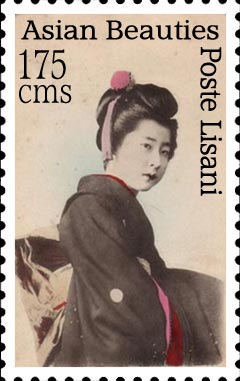
 Now comes to software part. Open both images in PhotoShop. Select the center, black area of the stamp template with the Magic Wand tool. Switch over to the geisha image, and select all of it (Ctrl+A). Copy it (Ctrl+C). Switch to the stamp template, and from the Edit menu, choose Paste Into (Shift+Ctrl+V). You’ll end up with a file that has two layers, and looks something like this one. It’s OK, but I’d be happier if the geisha was smaller, and more centered.
 To position the geisha, and make her the right size, go to the Edit menu, and choose Transform>Scale. Scale the image of the geisha down a bit, and while the tool is still open, shift her to the center of the stamp window. You’ll notice as you do this that she slides under the white border, rather than covering it—that’s the advantage of using Paste Into. The image will only shift within the window you chose for it before pasting. You’ll also notice that as you scale her, a funky cream border comes into view at the bottom and right edge of the image. Ick! Tuck those behind the white border of the stamp as much as possible. When you’re finished scaling and repositioning, your stamp will look something like this.
 Now we have a little background to clone, to fill in the top strip of black. This happens a lot when using images for stamps, because the normal proportion of a rectangular photo is different than the proportion of that used for stamps. I suppose this is because stamps need just a tad more height for text, but don’t quote me on that.
To fill the top strip, use the Clone Stamp tool, and choose a section of background to clone. Fill in the stripe, blending it with the other sections of background. I won’t go into detail on exactly how to do this—if you’re familiar with using the clone tool, you don’t need instructions, and if you’re not familiar with it, you should take the Adobe tutorial on how it works for your version. They always explain their tools better than anyone else can. When you’re finished cloning, your stamp should look something like this one. Now, let’s move on to text.
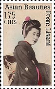 Text is a personal preference sort of thing for each artistamp maker. My stamps almost always have Poste Lisani, my issuing authority, on them somewhere. They also generally have some sort indicator of value on them. Sometimes I do some additional text, like a series or artist name. Regardless of what you choose to put on your stamp, you’ll have to make it somewhat readable. This takes some practice—what’s readable on screen isn’t always perfection when printed. Work with your chosen stamp size and your printer until you find a size and placement that works for you. It helps to look at some real stamps, and see how information is sized and positioned—but don’t let that confine you. You’re making your own stamps, so come up with your own rules.


